

Sero Global – designing brand clarity
Project deliverables:
- Brand identity
- Brand development
- Iconography
- Stationery
- Print collateral
- Website design
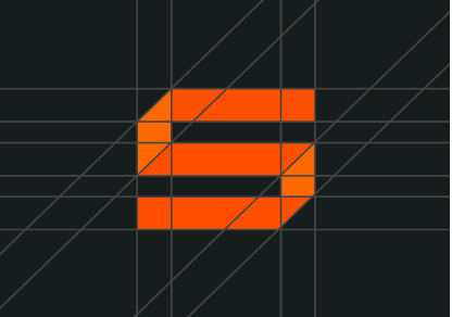
Working closely with the SERO Global team, I helped bring structure to the offering and develop a cohesive visual identity that could work across the main SERO brand, its individual product ranges and a wide range of marketing materials.
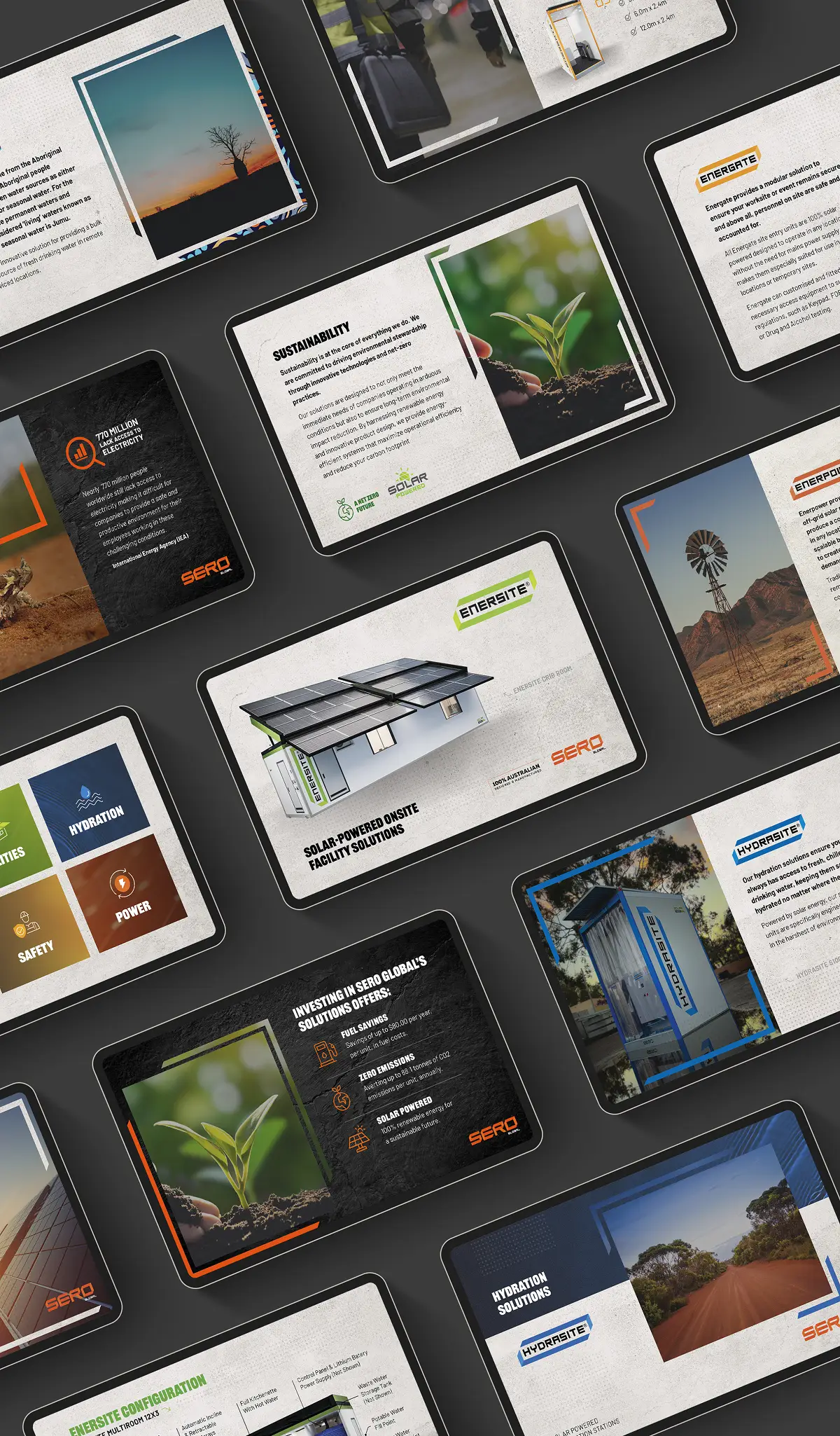
The project covered the brand identity, website, product branding, presentations, brochures, capability statements and technical documentation.
A brand built for tough environments
Gritty, not pretty
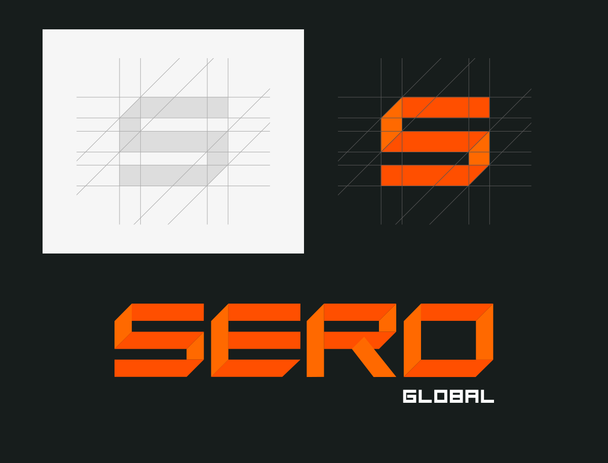
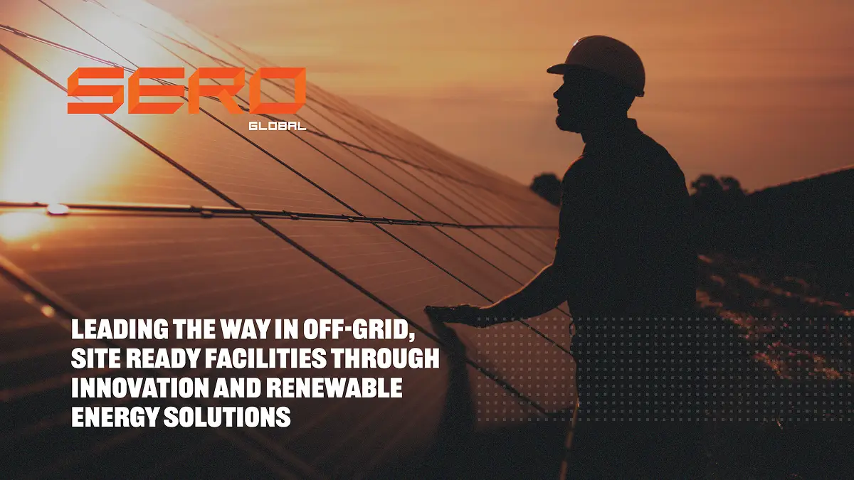
The phrase “gritty, not pretty” originated from feedback on an earlier design concept and quickly became a recurring theme throughout the project. It captured the direction we wanted to take with the SERO brand: bold and rugged, without losing its professional edge.
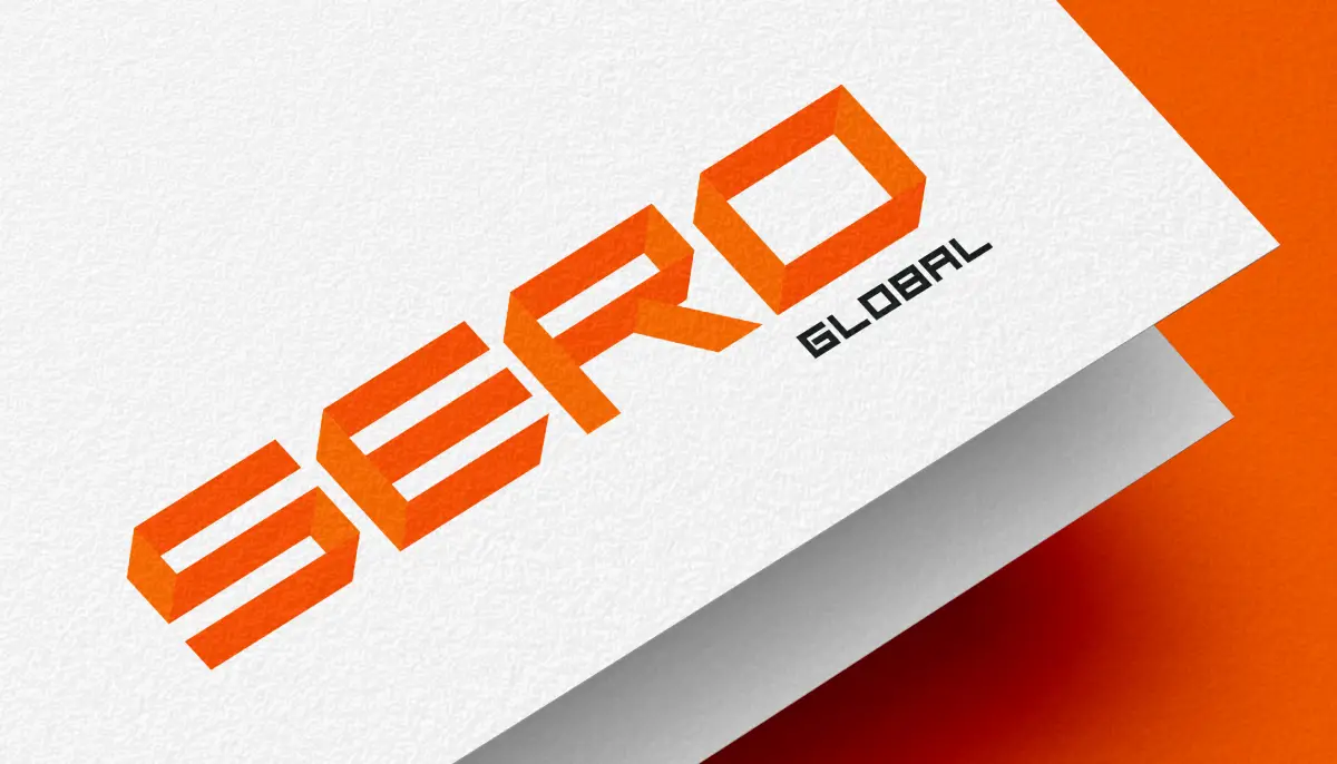
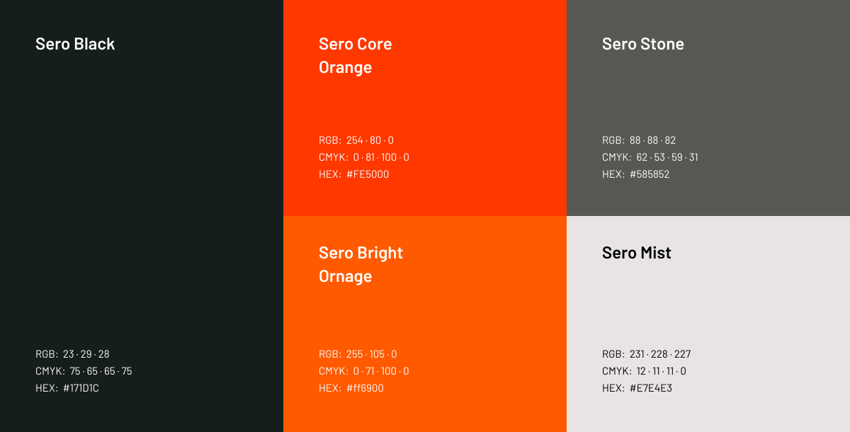
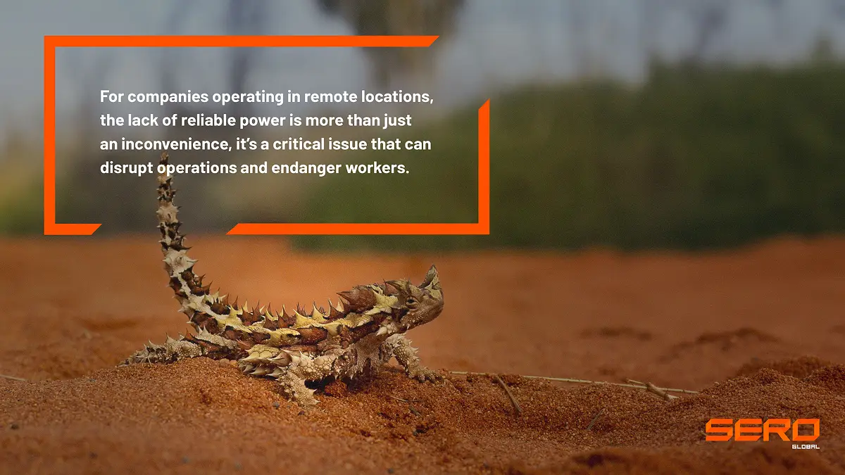
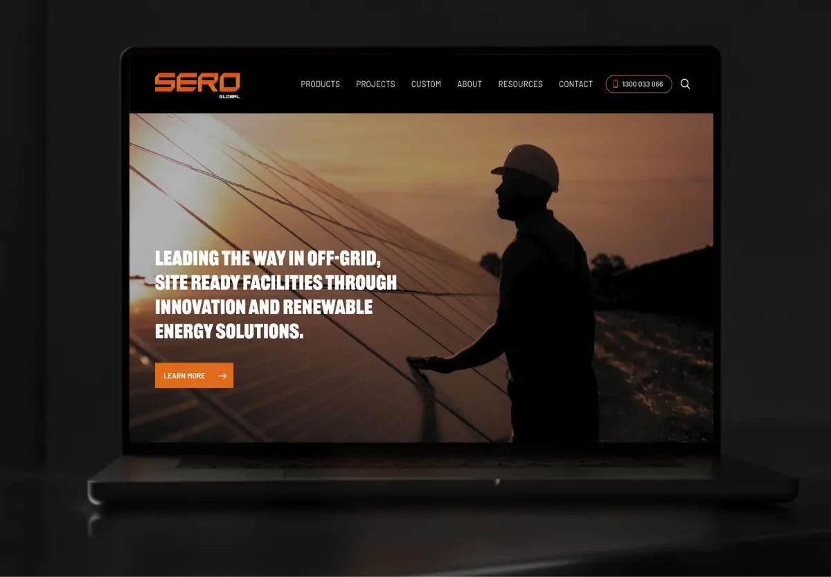
Textured slate and stone backgrounds, bold Railroad Gothic typography and photography treated with subtle black overlays and grain helped establish this industrial aesthetic. Angled accent lines, inspired by the logo, were used to frame imagery and create a consistent visual signature across the brand.
A family of brands designed to work together
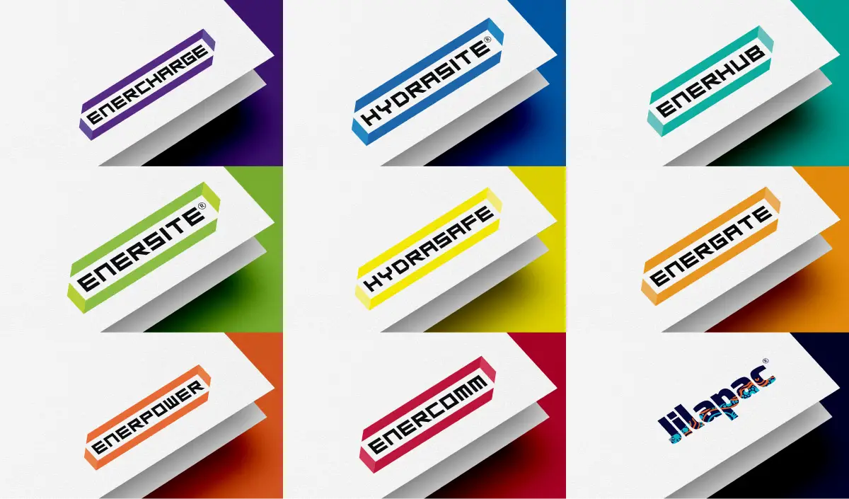
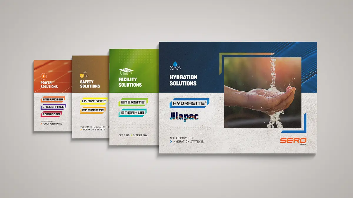
One of the key challenges was bringing structure to SERO Global’s expanding range of products and services. Working closely with the marketing manager, I helped organise the offering into four solution categories: Facilities, Hydration, Safety and Power. From there, we developed individual product identities that sat within each category while remaining connected to the overarching SERO Global brand.
Each logo was carefully developed to suit its individual product range, with considerable thought given to selecting colours that complemented one another while reflecting the relevant industry and market. Eight of the nine logos follow a consistent design structure, incorporating angled elements inspired by the SERO Global logo to create a visual connection across the brand family. Jilapac takes a different approach, with a standalone identity featuring an Indigenous-inspired aesthetic. Together, the identities provide a cohesive yet flexible system, allowing each product range to maintain its own character while sitting comfortably within the wider SERO Global offering.
From brand identity to marketing collateral
- Logo design and brand identity
- Brand colour palette and typography
- Visual direction and image treatments
- Brand guidelines
- Website design
- Four solution category identities: Facilities, Hydration, Safety and Power
- Nine product brand identities
- Product guides and technical data sheets
- Iconography
- Corporate presentations
- Brochure design
- Capability statement design
- Exhibition and display
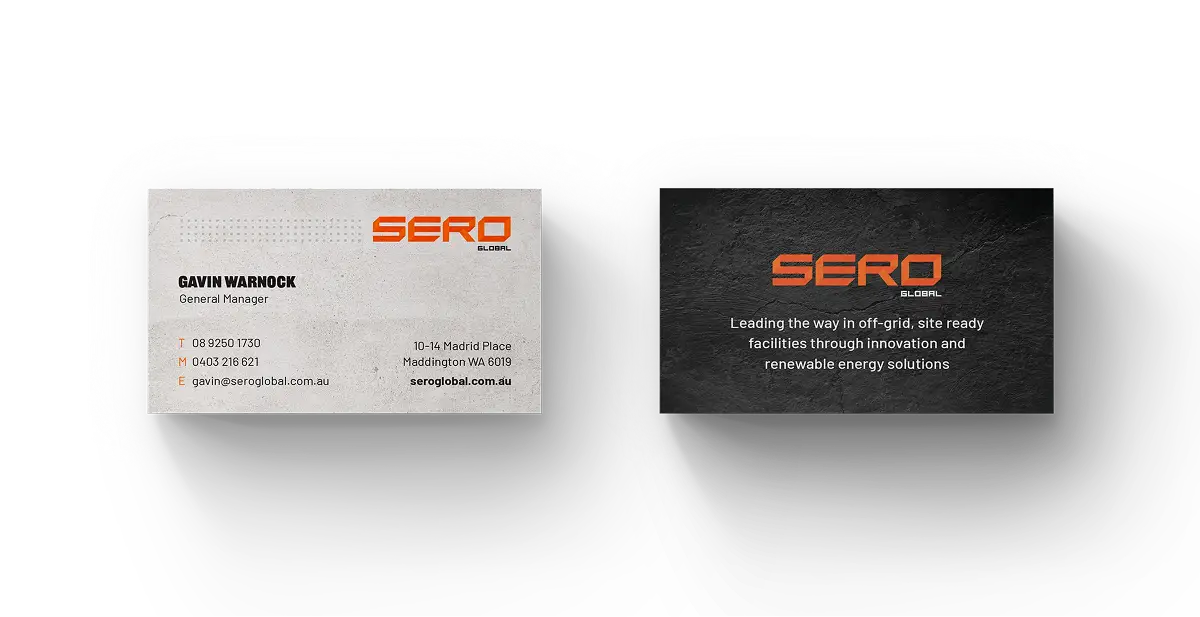
- Corporate stationery, including business cards
- Merchandise
What my client had to say

Brett played an important role in developing the SERO Global brand and bringing consistency to our expanding product portfolio.
He took the time to understand our business and worked closely with us to create a distinctive visual identity that could be applied across our website, product brands and marketing materials.
His creativity, attention to detail and collaborative approach made the entire process a positive experience.
Jeune Jiew
Marketing Coordinator